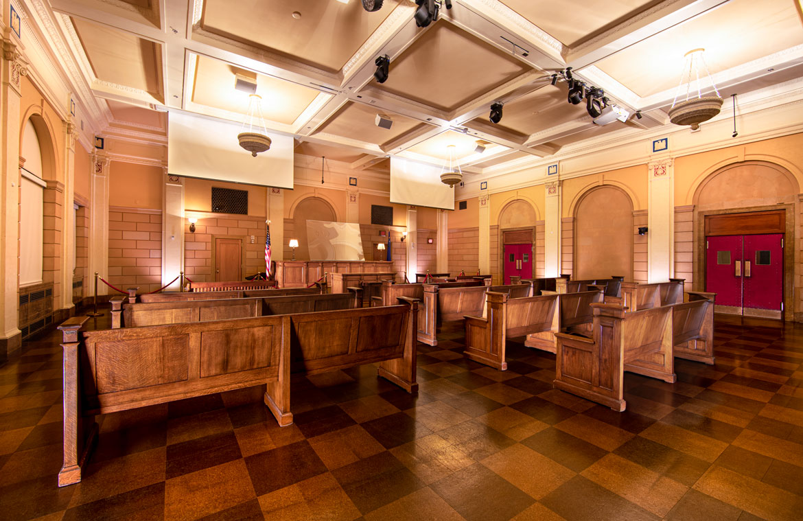
Client: Zuma ○ Cosmopolitan Resort ○ Las Vegas
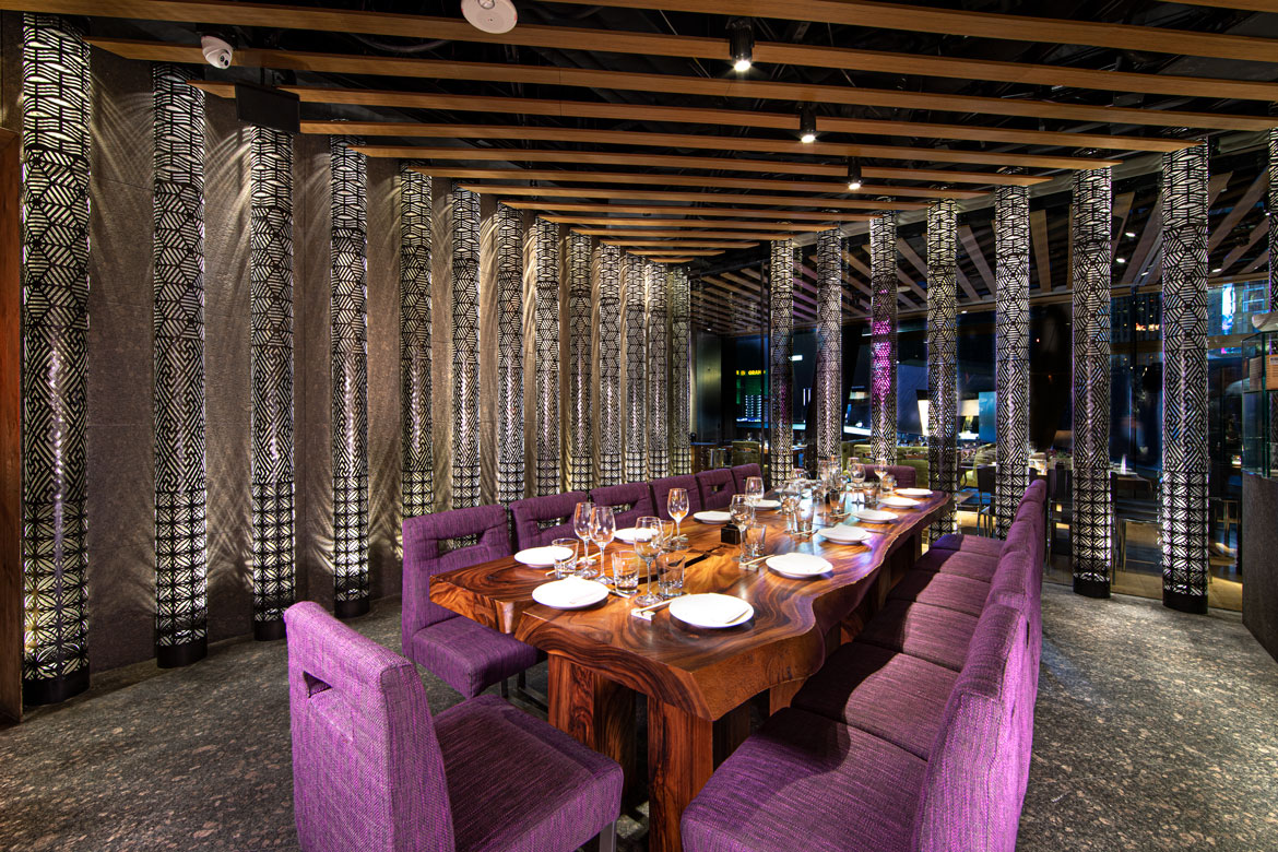
Tungsten 3200K Ballanced
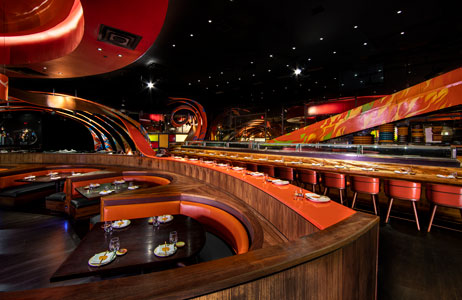
Client: SUSHISAMBA ⚬ Las Vegas
Daylight 5000K Ballanced
Client: ONE Eleven Ltd. ⚬ Las Vegas
Challenges of Interior Architectural Photography in Las Vegas
Natural Light, Incandescent Bulbs & LED Fixtures
Before I commit to any architectural photography project it’s critical to walk the space with the client to see what lighting obstacles, inherent to the location, need to be addressed. There are other factors to consider, but lighting is most important.
Custom designed homes in Las Vegas always have plenty of ceiling to floor windows with natural light pouring in, whereas hotel rooms and casino restaurants typically are void of any organic light source. Homes with ample windows may sound advantageous, but direct sunlight spearing through a scene creates too much contrast between the harsh light and the dark shadows it creates. For this situation I’ll calculate which direction the windows face in relation to the sun’s travel path for each room and then capture the rooms in sequence according to the sun’s schedule. Indirect sunlight is always your friend. Even better an overcast day which acts as a giant softbox diffusing the hard sunlight. Windowless casino restaurants pose their own hurdles with mixed lighting and hotel rooms with only one tiny tinted window are another.
Many of the restaurant interiors I photograph in Las Vegas are deep within resort & casino infrastructures and often lack any natural lighting. For architectural lighting designers this can be serendipity found, as they can tailor their lighting schemes to create an atmosphere that day or night looks spectacular since there are no nearby windows to affect the design. The majority of interior lighting designs these days are predominantly LED and for the most part provide an excellent light source with great energy savings. However, one of the drawbacks from this type of lighting is the inconsistency of color temperatures, known as kelvin. Kelvin refers to the color-cast, or color temperature, seen as soft yellow varying to whitish-blue and is denoted by the letter “k” on most LED lightbulbs.
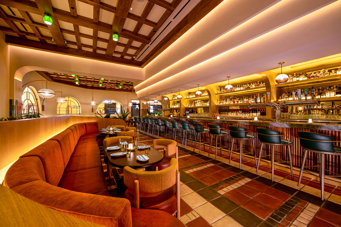
Client: Sugarcane ○ Venetian Resort ○ Las Vegas
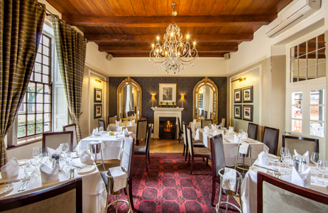
Mixed 5000K & 3200K
Client: Ernie Els - La Gratitude ⚬ Stellenbosch, South Africa
Mixed Lighting
When a room has varying color temperature light sources it’s referred to as "mixed lighting". Color temperatures need to be addressed to deliver an accurate image of the space. Your eyes easily correct these differences, but even the most advanced camera systems married with the best glass optics struggle with these variables. It’s inevitable that I always find a space using mixed color temperature light bulbs. This usually happens when bulbs have been replaced over time with different manufacturers’ bulbs. Even though they both read 3200k on the ballast their appearance is notably different when powered on. Even worse, when they are replaced with daylight color temperature bulbs (5000k) that color cast blue light. Blue light contamination is a common problem, but there is a work-around. In smaller rooms I often carry my own light bulbs and temporarily swap out the existing bulbs to provide consistency. For larger rooms, where it would take a scissor lift to change out all the ceiling bulbs, I’ll apply a hue correction layer in Photoshop and meticulously digitally hand-paint the areas that are problematic. For architectural photography of custom homes in Las Vegas I often battle with lighting designs using exclusively 3200k bulbs fighting against the 5000k blue light color casting via the windows. Color correcting architectural photography can be very time consuming in the post-process. This is where I spend the majority of my time on each Las Vegas architectural photography project.
Before digital, when all we had was film, remember having to choose between indoor or outdoor film…Tungsten or Daylight? The film manufactures were simply asking what light source you’d be photographing under - 3200k for interior Tungsten lighting, or 5000k for exterior sunlight.
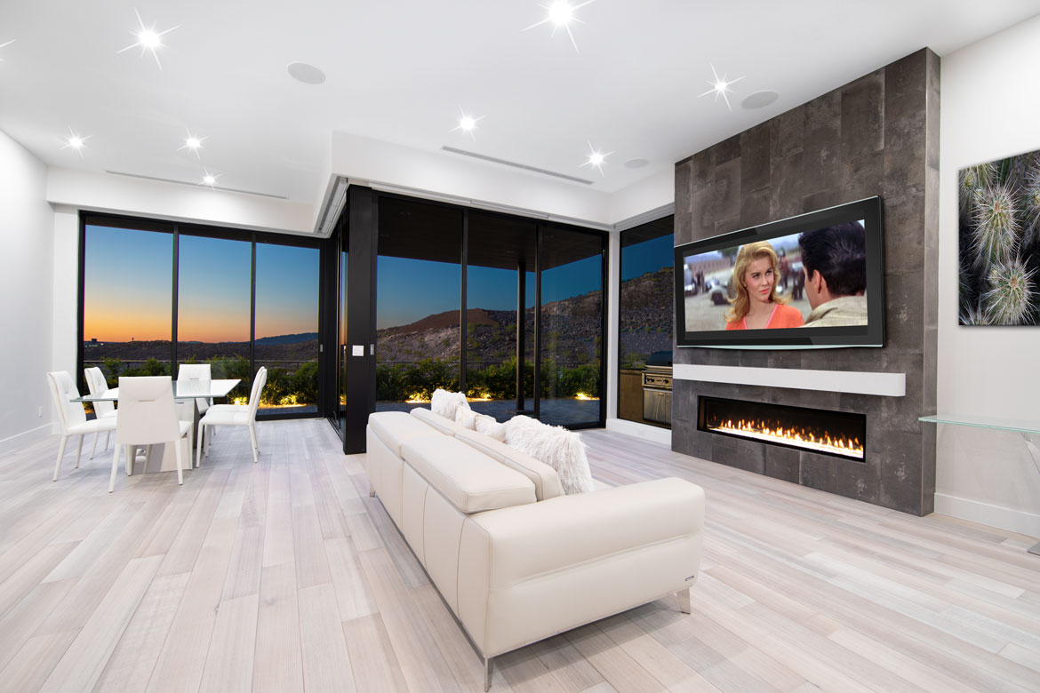
Client: Christopher Homes ○ Vu at MacDonald Highlands ○ Henderson, NV
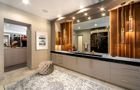
Client: ONE Eleven Ltd. ⚬ Las Vegas
Adding Light to an Existing Interior Lighting Design
Key, Fill & Pepper Lighting
Most restaurants in Las Vegas use recessed MR16, or advanced projection lighting fixtures to focus the light on the dining table, not on their patrons’ faces. Pair that with dark tabletops, wood surfaces, brightly colored accent walls, variable-colored fabrics and now you’ve got a super high-contrast scene to capture.
Yes, many of the latest cameras have built-in HDR (High-Dynamic-Range) exposure modes and Capture One, Photoshop and Lightroom can merge bracketed exposures into one file to compensate for those high and low areas of exposure using their proprietary algorithms, but there’s no substitute for properly lighting a room and capturing everything in-camera. Anything less than using best practice techniques always results in perfunctory architectural images.
To even out the lighting pattern in a particular room I’ll often use a mix of strobe lights paired with light modifiers (soft diffusion), or in tight spaces where my back is against a wall the Kino Flo light panels.
For specialty items in a room such as hanging art, objects of interest, accent walls, or dark areas in the background I’ll often place smaller “pepper” lights hidden in the distance to push extra lumens to ensure those elements stay relevant. Key lighting from left/right of the camera position falls off quickly (disappearing into the distance), so it’s important to light your background as well, to provide depth in the image.
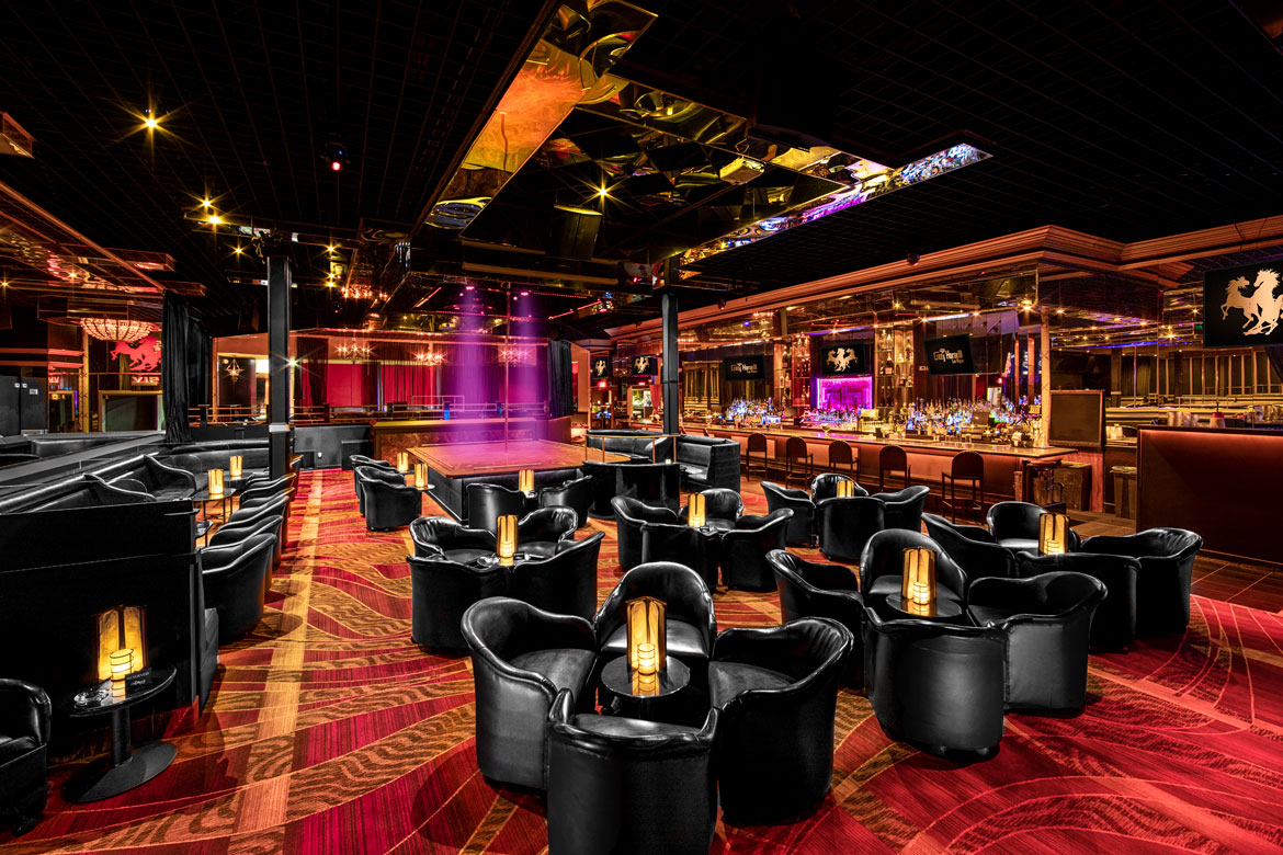
Client: Crazy Horse III ○ Las Vegas
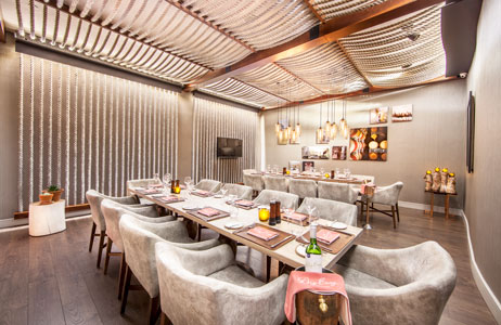
Client: Ernie Els - Big Easy ⚬ Durban, South Africa
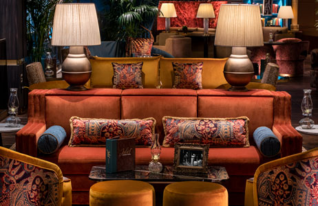
Client: Juliet Cocktail Room ⚬ Venetian Resort ⚬ Las Vegas
Architectural Photography Lenses
Ultra-Wide, Standard & Telephoto Lenses
My go-to optic for most architectural photography projects in Las Vegas, without question, is the ultra-wide-angle 14mm lens which, when paired with a full-frame 35mm sensor, provides an angle of view at 114°. For comparison the human eye captures life at approximately 120°. Of course, much of that field feathers out into our peripheral vision (blind spots), so there’s really no exact comparison. Most optical experts say a 40mm to 50mm lens provides a normalized angle of view with respect to the human eye.
In years past, ultra-wide-angle lenses always came with a host of issues such as frame corner vignetting and distortion of converging architectural lines (ceiling beams, doorways, window frames, etc.) that would fail to accurately capture a space, delivering an awkward or unnatural image. Thankfully, computer technology and precision laser technology has greatly aided in the process of manufacturing lens elements that can correct the aberrations of yesterday’s lenses. Oddly, now that lens manufactures have spent all their resources to correct these optical eccentricities, our smartphones and photo apps now provide filters to instantly add it back in… so your images look vintage.
One important note when using an ultra-wide-angle lens for interior design photography is placement of the camera. Ultra-wide-angle lenses tend to push everything in frame outward – exaggerating reality. If there’s three feet of carpet in center-frame bottom, it will appear there’s twelve feet of carpet in the captured image.
Round objects will appear oval, if not brought to the lens’ center of axis. Ceilings, walls, windows and countertops are fixed and since they are fixed, they dictate where the camera will be placed. This leaves furniture as the variable factor to bring balance in the image frame. Chairs need to be set perpendicular to the tables they stand in front of, so they appear parallel in the image otherwise they will appear skewed. I’ll often find myself shifting sofas, dining tables, floor lamps etc. just to negate the exaggeration the lens creates.
Next up are the 35mm wide-angle and the 100mm standard telephoto lenses. For tighter crops, where I want to highlight a specific room element, a longer focal length lens will provide a different perspective. Additionally, the longer the focal length, the shallower depth-of-field can be achieved. DoF in simple terms is the ability control where the focus begins (nearby) and where it ends (further away) by adjusting the lens’ aperture; the aperture controls the amount of light traveling through the lens, it also regulates the DoF. The lower the aperture number the shallower your depth-of-field will be – DoF isolates your subject by placing it in focus and pushing everything near and far out-of-focus.
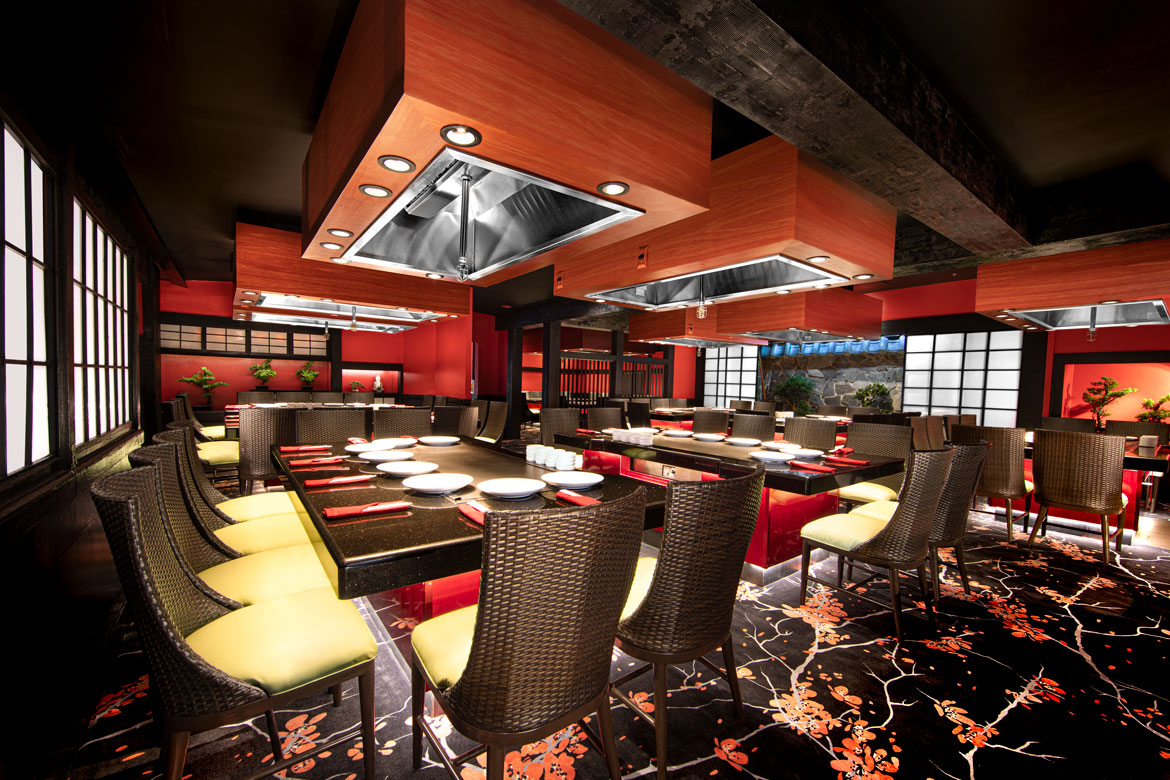
Client: Benihana ○ Westgate Resort ○ Las Vegas

Client: El Cortez Penthouse ○ Las Vegas
Prime vs Variable (Zoom) Lenses
First, I’m not a fan of variable focal length lenses - aka zoom lenses. However, they do have their place for photojournalists, event and street photographers. To be fair, if I did that type of work, I wouldn’t be on assignment without them. Without diving into the technicalities, as there are plenty of online articles discussing this subject, prime lenses provide a significantly better image quality when compared to their counterpart zoom lens at the same focal length. So why buy a zoom lens? The simple answer - when you don’t have a choice of camera position.
With a zoom lens, if you’re on vacation and want to take an image of a unique building or historic statue, you simply turn the zoom grip ring to find the desired crop. If stuck with a prime lens, you’ll need to physically move closer to achieve a full-frame capture. If you’re a live event photographer, tasked to capture images of a performer and unable to move while at a fixed position, you have the benefit of the zoom feature. For architectural photography I have the latitude to place the camera where best needed and the added bonus of superior image quality with the use of a prime lenses.
